Move beyond Pinterest boards and discover how to authentically blend Japanese minimalism and Scandinavian functionality into a home that feels both serene and deeply personal.
Japandi design represents a thoughtful convergence of two distinct cultural philosophies centered on mindful living. This guide explores the historical roots, core principles, and adaptable strategies to create spaces that honor wabi-sabi’s appreciation of imperfection alongside hygge’s emphasis on comfort. You’ll learn how to select colors that support visual calm, choose materials that develop character over time, and arrange furniture to cultivate intentional breathing room—while navigating real-world constraints with grace and avoiding common pitfalls like cultural superficiality or sterile minimalism.
Introduction
Step into a thoughtfully realized Japandi interior, and a gentle sense of calm settles. Sunlight filters through a linen curtain onto a hand-thrown ceramic vessel. A low-profile oak sofa invites connection without demanding attention. A single dried branch becomes a quiet focal point. This is not accidental minimalism. It emerges from centuries of design wisdom—Japanese aesthetics rooted in Zen principles and Scandinavian traditions shaped by climate and community—converging around shared human needs: sanctuary, authenticity, and presence.
The term “Japandi” (a blend of Japanese and Scandinavian) gained traction in design discourse around the early 2010s, though the philosophical alignment runs deeper. Post-war Scandinavian designers like Arne Jacobsen and Alvar Aalto championed functional beauty using local materials and clean lines. Simultaneously, Japanese aesthetics emphasized ma (meaningful negative space), wabi-sabi (beauty in transience and imperfection), and reverence for natural materials. Design historians observe that this convergence reflects shared human values responding to universal desires for meaning and respite—not cultural coincidence. Today, as digital saturation intensifies, Japandi offers more than visual appeal: a tangible framework for designing spaces that support mental restoration through intentionality.
The Japandi Synthesis Framework: Five Pillars of Harmonious Design
Authentic Japandi design operates as an integrated system where philosophy informs material choice, spatial arrangement shapes daily experience, and every element serves purpose or meaning. This framework transforms abstract ideals into adaptable decisions—whether selecting a textile, arranging furniture, or honoring seasonal shifts. Each pillar reinforces the others, creating resilience against fleeting trends and ensuring your space evolves meaningfully with you.
Pillar 1: Philosophy First — Where Wabi-Sabi Meets Hygge
Japandi begins as a mindset. Understanding foundational philosophies prevents spaces from feeling cold, sterile, or culturally superficial.
Wabi-Sabi: The Japanese Art of Imperfect Beauty
Rooted in Zen Buddhist teachings, wabi-sabi finds profound beauty in transience, asymmetry, and the marks of time. Wabi signifies rustic simplicity and quiet elegance; sabi honors the patina of age—the subtle crackle in pottery glaze, the gentle fading of indigo fabric, the grain variations in reclaimed wood. In practice:
– Choosing a hand-thrown mug with slight irregularities over factory-perfect uniformity
– Appreciating the evolving texture of oiled wood floors
– Leaving a section of plaster wall with visible artisan texture
– Displaying a single seasonal botanical element that changes daily
Why this matters: Environmental psychology research suggests environments embracing natural textures and subtle imperfections may support reduced cognitive load and greater emotional ease. A slightly uneven edge on a wooden shelf isn’t a flaw—it’s evidence of material honesty and human touch.
Hygge: The Scandinavian Essence of Cozy Contentment
Pronounced “hoo-gah,” hygge (Danish) or koselig (Norwegian) describes warmth, presence, and shared comfort. It lives in candlelight during winter evenings, thick wool socks, or gathering around a simple meal. Key elements include:
– Layered textiles: chunky knit throws, sheepskin rugs, linen curtains that soften light
– Warm, diffused lighting: multiple low-wattage sources instead of harsh overheads
– Sensory warmth: wood tones, ceramic textures, the gentle scent of beeswax
– Intentional gathering spaces: low seating arranged for face-to-face connection
Why this matters: Studies on well-being environments associate hygge-inspired elements with enhanced feelings of safety and social connection. In design terms, hygge ensures minimalism remains warm and human-centered. It answers: “How does this space make people feel when they’re in it?”
The Synthesis: Philosophy in Daily Practice
The synergy emerges where these philosophies intersect. Wabi-sabi provides the why (embracing authenticity); hygge provides the how (creating tangible comfort). Consider a living area:
– A low oak coffee table (Scandinavian functionality) shows subtle tool marks (wabi-sabi authenticity)
– A handwoven wool throw offers tactile warmth (hygge) while its irregular weave honors the maker’s hand (wabi-sabi)
– A shoji-inspired paper lantern casts soft light (hygge) with visible fiber texture (wabi-sabi detail)
Guiding Reflection: Avoid treating these as interchangeable buzzwords. Wabi-sabi isn’t “messy minimalism”; hygge isn’t merely “adding candles.” With each choice, gently ask: “Does this object honor the passage of time (wabi-sabi) AND foster present-moment comfort (hygge)?”
Pillar 2: The Dance of Space — Ma and Lagom in Practice
How you honor emptiness is as vital as how you arrange objects. This pillar transforms theoretical concepts into tangible layouts that feel expansive yet intimate, uncluttered yet welcoming.
Ma: The Japanese Power of Negative Space
Ma (pronounced “mah”) is the intentional void—the pause between musical notes, the breathing room around a single flower. In Japanese aesthetics, ma is active and purposeful. Practical applications:
– Leaving significant wall space intentionally bare. A single scroll painting (kakemono) on a vast wall isn’t sparse—it’s deliberate.
– Positioning seating to create clear pathways. Floating a sofa slightly into the room defines zones and encourages flow.
– Embracing visual rest. Displaying three meaningful objects with generous space between them allows each to be truly seen.
Illustrative Example: In documented Tokyo apartment designs, a modest living area feels expansive because furniture occupies only the perimeter. The central ma space isn’t “empty”—it’s used for morning movement, children’s play, or simply allowing light to travel unobstructed. The space breathes with daily life.
Lagom: The Scandinavian Principle of “Just Enough”
Swedish for “just the right amount,” lagom rejects both scarcity and excess. It’s the Goldilocks principle applied to design: not too little, not too much, but balanced for your life. Implementation strategies:
– The “One-In, One-Out” practice: For every new item brought home, consciously release one to maintain equilibrium.
– Functional curation: Keep only what serves genuine purpose or sparks consistent joy. A bookshelf holds beloved books, not dusty volumes.
– Proportional scaling: Choose furniture scaled to your room. Two modest armchairs with a narrow console create intimacy where a massive sectional would overwhelm.
Why Lagom Prevents Sterility: Pure minimalism can feel institutional. Lagom injects humanity by honoring individual needs. A family might have thoughtfully integrated toy baskets in the living area—not hidden away, but curated with care. The space remains calm because quantity is intentional, not because emotion is suppressed.
Synthesizing Ma and Lagom: A Spatial Approach
Combine these principles for spaces that feel both serene and lived-in:
1. Begin with Ma: Clear the room mentally. Sit quietly. Notice light paths, airflow, where your eye rests. This awareness is your foundation.
2. Apply Lagom: Reintroduce only what is essential for function and joy. Place the largest necessary piece first, ensuring comfortable clearance around it.
3. Create Visual Pauses: Between functional zones (seating area, reading nook), leave intentional gaps. These aren’t “dead zones”—they’re ma that allow the eye to rest.
4. Test the Flow: Walk through slowly. Do you feel rushed? Cramped? If yes, consider removing one item. True lagom feels effortless.
Gentle Reminder: A room with perfectly spaced furniture but cluttered surfaces overlooks ma. A room with bare walls but oversized furniture overlooks lagom. Harmony requires both spatial generosity and curated content.
Pillar 3: Material Harmony — The Language of Natural Elements
Materials communicate warmth, history, and intention without words. This pillar explains why specific materials resonate, how to source them thoughtfully, and how to combine them for layered authenticity.
The Core Material Palette: Why Natural Elements Resonate
Japandi design consistently returns to materials that connect us to the earth. Research indicates brainwave patterns may shift toward calm states when viewing natural textures versus synthetic alternatives. Here’s the foundational palette:
| Material | Japanese Context | Scandinavian Context | Sensory Qualities | Aging Character |
|---|---|---|---|---|
| Oak (Light) | Keyaki (zelkova) in traditional joinery | Danish modern furniture staple | Warm honey tones, pronounced grain | Develops rich amber patina; scratches blend into history |
| Ash | Used in tea ceremony utensils | Iconic in mid-century chairs (Wegner) | Pale, subtle grain with gray undertones | Lightens slightly; maintains clean appearance |
| Bamboo | Symbol of resilience; used in screens | Valued for sustainability | Smooth, linear texture | Darkens to warm caramel; may develop cherished hairline cracks |
| Linen | Ramie fiber in summer kimono | Traditional Danish table linens | Crisp yet soft; visible slubs (textural irregularities) | Softens dramatically with washing; develops gentle wrinkles |
| Wool | Less common historically (Japan is humid) | Core to Nordic textiles (rya rugs, throws) | Dense pile; insulating; subtle natural scent | Felts slightly with use; gains depth of color |
| Paper (Washi) | Shoji screens; wagashi wrapping | Used in Scandinavian lampshades (PH series) | Translucent; fibrous texture; soft light diffusion | Gentle yellowing is valued; tears become part of story |
| Clay/Ceramic | Bizen-yaki (unglazed pottery); raku | Studio pottery movement (Stig Lindberg) | Earthy weight; matte or subtle glaze | Glazes craze (fine cracks); stains tell use history |
Critical Insight: Magic lies in contrast within harmony. Pair rough-hewn oak (Scandinavian lagom functionality) with delicate washi paper (Japanese ma translucency). Combine nubby linen (Scandinavian hygge texture) with smooth river stone (Japanese wabi-sabi natural form). This creates visual interest without chaos.
Sourcing with Integrity: Beyond Aesthetics
Authentic Japandi honors the story behind materials. Avoid mass-produced items that mimic the look but lack soul:
– Wood: Seek FSC-certified oak or ash. Reclaimed wood carries inherent wabi-sabi history. Consider: “Where was this material sourced? How was it harvested?”
– Textiles: Choose GOTS-certified linen or wool. Vintage Scandinavian rugs (rollakan flatweaves) or Japanese boro (patched indigo textiles) add layers of human history.
– Ceramics: Support local potters using traditional methods. A mug with visible finger marks embodies wabi-sabi more authentically than mass-produced “artisan-style” pottery.
Adaptable Pathways:
– Method A (Ideal): Commission a local woodworker for a single shelf using reclaimed timber.
– Method B (Budget-Conscious): Sand and re-oil an existing oak shelf. The act of caring for it imbues personal history.
– Method C (Temporary/Rental): Use removable wood-look vinyl on a plain shelf, but pair it with a genuinely handmade ceramic object to anchor authenticity.
Material Layering Approach: Sensory Proportions
Move beyond rigid percentages. Apply this sensory layering:
– Foundation (Approx. 60%): Large surfaces that set the tone—light oak floors, plaster walls, linen sofa upholstery. These should feel neutral, calm, and durable.
– Texture (Approx. 30%): Medium elements adding tactile warmth—wool throw, seagrass basket, woven rattan chair. These invite touch and signal hygge.
– Soul (Approx. 10%): Small, intentional accents with history—a boro fragment framed as art, a single Bizen vase, a hand-carved wooden spoon. These embody wabi-sabi and prevent sterility.
Room Application Example: In a bedroom:
– Foundation: Unbleached cotton bedding on a low platform bed with light ash legs
– Texture: Chunky oat-colored knit throw at the foot of the bed; jute rug beside the bed
– Soul: A single indigo-dyed tenugui (Japanese hand towel) folded on the nightstand; a small stone collected from a meaningful walk
Pillar 4: Color Alchemy — Building a Soulful Neutral Palette
Color in Japandi creates a visual sanctuary that supports emotional regulation. This pillar moves beyond “beige and white” to reveal the nuanced psychology of neutrals and intentional accent use.
The Neutral Foundation: Intentional Earth Tones
Japandi neutrals draw from natural landscapes and traditional pigments. Each shade carries cultural resonance and physiological effect:
| Color Family | Specific Shade Examples | Japanese Origin | Scandinavian Origin | Consideration |
|---|---|---|---|---|
| Whites | Shiro (pure white), Nunokuro (unbleached cotton) | Shoji screens; washi paper | Limewashed walls; snowy landscapes | Expands space; enhances light; choose whites with subtle warmth |
| Grays | Nezumi-iro (mouse gray), weathered stone | Sumi ink washes; mountain mist | Granite cliffs; overcast skies | Calming; reduces visual noise; lean warm (greige) over cool |
| Browns | Cha-iro (tea brown), Ki-iro (wood yellow) | Tataki earth floors; kintsugi lacquer | Pine forests; birch bark | Grounding; evokes safety; connects to earth |
| Blacks | Sumi (ink black) | Calligraphy; shoji frame accents | Cast iron stoves; charcoal | Adds definition; creates visual rest; use sparingly |
Practical Guidance: Avoid cool, sterile whites (like “Decorator White”). Choose whites with subtle warmth: unbleached cotton, oat, or bone. Similarly, favor grays with warm undertones (greige). Test paint samples at different times of day—morning light reveals undertones evening light hides. If your room has limited natural light, warm undertones prevent a cold feel. If your space is sun-drenched, slightly cooler neutrals like soft greige can balance visual warmth.
The Accent Strategy: Intentional Pops with Purpose
Accents in Japandi are rare, meaningful, and deeply symbolic. They follow the wabi-sabi principle of “less but better.” Never use accents merely for decoration. Ask: “Does this color serve a story or function?”
- Indigo (Ai-iro): Historically used in Japanese aizome (indigo dyeing) and Scandinavian workwear. Represents depth, calm, and craftsmanship. Application: A single kasuri (ikat) pillow on a linen sofa; the binding on a boro textile fragment.
- Earth Red (Beni-iro): From Japanese beni (safflower dye) and Scandinavian clay pots. Symbolizes warmth, life, and hearth. Application: A small Bizen ceramic bowl; the interior of a handmade paper lantern.
- Moss Green (Koke-iro): Reflects Japanese garden moss and Scandinavian forest floors. Evokes renewal and quiet growth. Application: A single potted shimpaku juniper; the glaze on a stoneware mug.
Why Restraint Matters: Research suggests excessive color variety may increase cognitive load. Limiting accents to 1-2 colors per room allows the visual field to rest. That single indigo pillow isn’t “boring”—it’s a visual anchor that supports calm.
Room-by-Room Color Guidance:
– Living Room: Walls in warm white (shiro), large rug in oat-colored wool, single indigo accent pillow. Why: Creates an expansive yet cozy gathering space where conversation flows without visual distraction.
– Bedroom: Walls in soft greige (nezumi-iro), bedding in unbleached linen, one small moss green ceramic vase on nightstand. Why: Warm neutrals support relaxation; minimal accents prevent mental stimulation before sleep.
– Kitchen: Light ash cabinets, plaster backsplash with subtle texture, black sumi-style handles on drawers. Why: Clean foundation supports function; dark accents provide visual definition for safety.
Gentle Reminder: Adding “just one more” accent color can disrupt cohesive calm. If you crave warmth, layer textures within your neutral palette—a chunky cream knit throw adds coziness without chromatic complexity.
Pillar 5: Craft and Imperfection — Honoring the Human Hand
This pillar transforms Japandi from visual style into values-driven practice. It’s where ethics meet aesthetics, and where your space gains soul. Mass-produced items, even if they mimic the look, often lack the subtle humanity that defines authentic Japandi.
The Language of Making: Reading the Marks
True craftsmanship leaves gentle evidence of its creation. Learn to “read” objects:
– Wood: Look for subtle tool marks from hand planes (not machine-smooth perfection). A slight variation in leg thickness shows human adjustment. Why it matters: These micro-imperfections create visual rhythm and honor the maker’s skill.
– Ceramics: Seek kannyu (crazing)—fine cracks in glaze from cooling. Embrace slight warping in hand-thrown forms. Why it matters: In Japanese pottery tradition, kannyu is celebrated as the piece “breathing.” It signifies authenticity versus factory uniformity.
– Textiles: Notice slubs in linen (natural thick/thin threads), irregular weave in hand-loomed rugs, visible mending in boro. Why it matters: These aren’t flaws—they’re proof of slow, intentional making. They invite closer looking and deeper appreciation.
Illustrative Comparison:
– Object A: Machine-made ceramic, perfectly symmetrical, uniform glaze. Feels anonymous.
– Object B: Hand-thrown stoneware, slight asymmetry, glaze pools thicker at the base. Feels storied.
In a Japandi space, Object B holds a single branch. Its imperfections become part of the composition—wabi-sabi in action.
Ethical Sourcing: Aligning Values with Objects
Japandi philosophy embraces longevity and respect. Every acquisition might consider:
– Origin: Who made this? Under what conditions? Seek artisans paid fairly (look for Fair Trade certification or direct studio relationships).
– Longevity: Will this last decades? Solid wood > particle board; natural fibers > polyester.
– Repairability: Can it be fixed? A wooden chair with traditional joinery can be reglued; glued particle board cannot. Kintsugi (golden repair) philosophy applies here: objects gain value through mending.
Practical Framework for Acquisition:
1. Pause: Before buying any non-essential item, wait 48–72 hours. Does the desire persist? This filters impulse buys.
2. The “Why” Reflection: “Why do I want this? Does it serve function, joy, or memory?” If the answer relates only to trend, pause.
3. Lifecycle Consideration: “Where might this be in 10 years? Can it be repaired, repurposed, or composted?” Prioritize items with circular lifecycles.
The Role of Vintage and Heirlooms
Nothing embodies Japandi values like objects with history. A 1950s Danish teak chair carries hygge warmth from decades of use. A Japanese furoshiki (wrapping cloth) passed through generations holds wabi-sabi patina. Integrating these:
– Creates instant depth and story
– Reduces environmental impact
– Honors cultural continuity when sourced respectfully
Thoughtful Sourcing Guidance:
– Vintage Shops: Look for solid wood furniture with clean lines. Danish mid-century pieces often align well.
– Antique Markets: Seek Japanese tansu (storage chests) or shoji screens—but verify ethical provenance. Avoid sacred or ceremonial objects sold as decor.
– Family Heirlooms: That worn wooden spoon from your grandmother? Display it. Its scratches tell a story of nourishment—pure wabi-sabi.
The Guiding Insight: Authentic Japandi design emphasizes cultivating an atmosphere of intentional calm where every element serves purpose or meaning. The most resonant spaces aren’t curated collections—they’re living environments of memory, mindfulness, and gentle presence.
Room-by-Room Implementation: Bringing Japandi to Life
Theory becomes transformative when applied to daily living. This section translates the five pillars into adaptable strategies for each key space, addressing real-world constraints like square footage, light conditions, and family dynamics. Each solution includes why choices work, how to execute them, and adaptations for common challenges.
The Living Room: Creating a Sanctuary for Connection
The living room is Japandi’s emotional heart—a space designed for both quiet solitude and meaningful connection. Prioritize human interaction over passive screen viewing.
Spatial Layout Strategy:
– Seating Arrangement: Float two low-profile armchairs (light oak frames, linen upholstery) facing each other with a narrow console table between them. Add a small floor cushion (zabuton) nearby for flexibility. Why: Creates an intimate conversation circle honoring ma (space between seats) and lagom (only essential seating).
– Focal Point: Create a tokonoma-inspired alcove: a simple floating shelf holding one seasonal object (a branch in spring, a smooth stone in winter) and a small washi paper lantern. Why: Provides visual rest and changes with seasons—core wabi-sabi practice.
– Pathways: Maintain clear pathways around seating. Why: Honors ma by allowing movement without obstruction; critical for small spaces to feel expansive.
Material & Color Execution:
– Flooring: Light oak wide-plank floors (reclaimed if possible). Alternative: Large-format light gray tile with subtle texture if hardwood isn’t feasible.
– Textiles: Layer a flat-weave rollakan rug (oat-colored wool) over the floor. Drape a chunky cream knit throw over one chair. Why: Wool provides hygge warmth; flat weave maintains visual lightness.
– Accents: One indigo-dyed kasuri pillow on the sofa. A single Bizen ceramic vase holding dried botanicals. Why: Limited accents prevent visual clutter; natural materials age gracefully.
Lighting Design:
– Primary: Multiple low-level sources: floor lamp with paper shade beside reading chair, small table lamp on console.
– Ambient: String washi paper lanterns across a corner (battery-operated for rentals).
– Critical Practice: Minimize harsh overhead lighting. Use dimmers on all fixtures where possible. Why: Soft, diffused light mimics natural daylight patterns, supporting visual comfort.
Small Space Adaptation (Under 200 sq ft):
– Use a wall-mounted drop-leaf table instead of a coffee table. Fold down only when needed.
– Choose a loveseat instead of two chairs. Opt for light-colored upholstery to reflect light.
– Install floor-to-ceiling sheer linen curtains to create vertical illusion of height.
Family-Friendly Adaptation:
– Select performance linen (Crypton® fabric) for upholstery—stain-resistant yet natural-looking.
– Store toys in a low, lidded seagrass basket (lagom curation). Rotate toys weekly to maintain calm.
– Anchor the space with one “untouchable” wabi-sabi object (e.g., a stone on a high shelf) to gently teach respect for beauty.
The Bedroom: A Retreat for Restorative Rest
Your bedroom should function as a sensory sanctuary—designed explicitly to support rest. Every choice here contributes to an environment that signals safety and calm.
Spatial Layout Strategy:
– Bed Placement: Position bed against the longest wall, centered if possible. Leave comfortable clearance on both sides. Why: Creates visual balance (lagom) and clear pathways (ma).
– Nightstands: Use two identical low platforms (light ash) instead of bulky cabinets. Why: Visual lightness enhances calm; identical pieces create harmony.
– Empty Space: Keep the floor clear except for a small rug beside the bed. Why: Ma principle—empty floor space feels expansive and supports nighttime safety.
Material & Color Execution:
– Bedding: Unbleached organic cotton or linen duvet cover and sheets. Why: Natural fibers regulate temperature; undyed fabrics avoid unnecessary chemical exposure.
– Textiles: Layer a thin wool blanket at the foot of the bed for hygge warmth. Add one small lumbar pillow in moss green linen. Why: Limited layers prevent visual busyness; wool provides comforting weight.
– Walls: Paint in soft greige (nezumi-iro) with clay-based paint for subtle texture. Why: Warm neutrals support relaxation; matte finish absorbs light gently.
Lighting & Sensory Details:
– Bedside Lighting: Wall-mounted swing-arm lamps with fabric shades (no visible bulbs). Why: Provides focused reading light without glare; frees nightstand surface.
– Light Control: Install blackout roller shade behind sheer linen curtains. Why: Maintains daytime aesthetic while ensuring darkness for sleep.
– Scent: Place a small ceramic dish with 2–3 drops of hinoki (Japanese cypress) essential oil on the nightstand. Why: Aromatic woods like hinoki are associated with calm in traditional practice; ceramic dish honors material authenticity.
Apartment Rental Adaptation:
– Use removable wallpaper with subtle wood-grain texture on one accent wall behind the bed.
– Place a large floor mirror opposite the window to amplify natural light (ma illusion of space).
– Choose a platform bed with built-in storage to minimize furniture footprint.
Shared Bedroom Adaptation (Partners with Different Tastes):
– Agree on neutral foundation (bedding, walls). Allow one personal accent per side: Partner A uses an indigo pillow; Partner B uses a moss green ceramic lamp. Why: Honors individuality within shared lagom framework.
– Create “zones” with a narrow bookshelf divider if space allows. Why: Respects ma between personal territories.
The Kitchen and Dining Area: Nourishment and Gathering
Kitchens reveal Japandi’s functional soul. This isn’t about hiding appliances—it’s about creating a space where cooking feels meditative and meals become rituals of connection.
Spatial Layout Strategy:
– Work Triangle: Maintain efficient flow between sink, stove, and refrigerator. Why: Scandinavian lagom functionality—minimizing steps reduces fatigue.
– Dining Zone: Place a solid wood table (light oak, trestle base) near natural light. Use bench seating on one side, chairs on the other. Why: Bench saves space; mixed seating adds wabi-sabi asymmetry.
– Open Shelving: Install two floating shelves above the sink for daily-use ceramics. Why: Displays beautiful objects (hygge joy) while keeping counters clear (ma).
Material & Color Execution:
– Cabinets: Paint existing cabinets in warm white (shiro). Replace hardware with black sumi-style pulls. Why: Warm white feels clean without sterility; dark accents provide visual definition.
– Countertops: Butcher block island (renewable with oiling) or honed concrete. Why: Natural materials develop patina; concrete’s cool surface suits specific tasks.
– Dining Table: Solid ash with visible grain. Why: Ash is durable for daily use; grain variations celebrate wabi-sabi.
Functional Details with Soul:
– Utensil Display: Store wooden spoons and whisks in a hand-thrown ceramic crock on the counter. Why: Honors craft; makes tools accessible (lagom efficiency).
– Daily Ritual Object: Keep a single kyusu (Japanese teapot) or Danish ceramic pitcher on the table. Why: Signals intentionality around nourishment.
– Waste Solution: Use a woven seagrass bin for compost. Why: Natural material integrates waste management into aesthetic (lagom responsibility).
Small Kitchen Adaptation (Galley Style):
– Install a narrow butcher block counter extension on casters for prep space. Tuck away when not in use.
– Use magnetic strips to hang knives—frees drawer space and displays tools as art.
– Choose light-colored open shelving to avoid visual weight.
Open-Plan Adaptation:
– Define the kitchen zone with a change in flooring (light oak planks vs. living room rug).
– Use a low room divider (like a tsuitate screen) between kitchen and living area if needed. Why: Creates ma separation without walls.
Home Office and Nooks: Focused Calm in Small Spaces
In our hybrid work era, dedicated nooks prevent work from infiltrating rest spaces. Japandi principles excel here by minimizing distraction and supporting focus.
Spatial Layout Strategy:
– Desk Placement: Position desk perpendicular to window (not facing it directly). Why: Natural light illuminates workspace without screen glare; avoids ma disruption of direct window view.
– Chair Selection: Choose an ergonomic chair with natural materials (oak frame, wool seat). Why: Supports body during long hours; natural textures reduce visual fatigue.
– Vertical Space: Install one floating shelf above desk for essential items only. Why: Keeps surface clear (ma); encourages lagom curation of supplies.
Material & Color Execution:
– Desk Surface: Light ash or bamboo. Why: Warm wood tones reduce eye strain versus stark white desks.
– Walls: Paint in soft clay color (warm beige). Why: Creates gentle visual boundary; less stimulating than bright white.
– Textiles: Small wool rug under chair. Linen desk pad. Why: Absorbs sound; adds tactile comfort (hygge).
Focus-Enhancing Details:
– Task Lighting: Adjustable brass desk lamp with warm LED bulb (2700K). Why: Directs light precisely; brass develops patina (wabi-sabi).
– Digital Boundary: Small wooden tray holds phone/watch during focused work sessions. Why: Physical boundary supports mental focus.
– Nature Connection: Single small shimpaku juniper in ceramic pot on shelf. Why: Biophilic elements are associated with reduced stress in workspace studies.
Closet Office Adaptation:
– Install wall-mounted fold-down desk. Use when needed, fold away after.
– Paint interior walls a calming moss green. Why: Creates psychological “room within a room.”
– Add battery-operated washi paper lantern for ambient light.
Window Nook Adaptation:
– Build a low platform bench under window with storage inside. Top with thick cushion and lumbar pillow.
– Add a small wall-mounted shelf for books. Why: Transforms unused space into hygge reading nook honoring ma.
Navigating Common Frictions: Adapting Japandi to Your Reality
Authentic design meets life’s complexities. This section addresses real-world constraints with compassionate, actionable solutions—proving Japandi isn’t about perfection, but thoughtful adaptation.
“My Space is Small and Dark”
The Challenge: Limited square footage and minimal natural light can make light palettes feel cold or cramped.
Adaptive Framework: Amplify light perception, maximize spatial flow, prioritize multi-functionality.
- Color Strategy: Paint walls, trim, and ceiling in the same warm white (shiro). Why: Eliminates visual breaks that fragment space; warm undertones prevent sterility. Consider clay-based paint for subtle texture.
- Reflective Surfaces: Place a large, frameless mirror opposite the main light source. Why: Enhances perceived light and space without visual clutter. Avoid ornate frames that disrupt calm.
- Furniture Scaling: Choose pieces with visible legs (e.g., sofa on tapered oak legs). Why: Creates visual flow beneath furniture, enhancing ma. Opt for nesting tables that tuck away.
- Lighting Layers:
- Ambient: Wall sconces with upward-facing shades (bounces light to ceiling)
- Task: Adjustable swing-arm lamp at seating area
- Accent: Small washi paper lantern on shelf
Why: Multiple low-level sources feel expansive versus one harsh overhead.
If your space has only one window, position the mirror to capture and redistribute that light. - Textile Trick: Use sheer linen curtains hung close to ceiling and wide beyond window frame. Why: Creates illusion of taller, wider window; linen diffuses light softly.
Illustrative Example: A compact urban studio used these techniques: warm white walls, strategic mirror placement, low platform bed with storage, and layered lighting. Residents noted the space felt “calm and surprisingly spacious” despite constraints.
“I Live in a Rental with Limitations”
The Challenge: Cannot paint walls, install permanent fixtures, or alter flooring. Concern about security deposit.
Adaptive Framework: Work with existing elements, use removable solutions, focus on portable layers.
- Wall Transformation:
- Method A: Removable wallpaper with subtle wood-grain or textured finish on one accent wall.
- Method B: Large-scale woven tapestry (Japanese noren style or Scandinavian rya) hung with tension rod.
- Method C: Lean a large floor mirror against wall to reflect light and shift focus from wall color.
Why: Changes visual temperature without damage; tapestries add hygge texture. - Flooring Solutions:
- Layer large, light-colored jute or sisal rug over existing floor.
- Add smaller vintage rollakan rug on top for color/texture.
Why: Defines zones; natural fibers feel authentic; easily rolled up when moving. - Lighting Overhaul:
- Replace harsh overhead bulbs with warm LED (2700K).
- Use plug-in wall sconces (no hardwiring) or multi-headed floor lamps.
Why: Instantly transforms ambiance; completely reversible. - Hardware Hack: Use removable adhesive hooks to hang washi paper lanterns or small shelves. Why: Creates ma without nails.
Practical Tip: Photograph the space before moving in. Document existing conditions. This protects your deposit while giving creative freedom within boundaries. Remember: Japandi is about intention, not perfection. A single well-placed indigo pillow on a rental sofa speaks volumes.
“I Have Children and Pets — How Do I Maintain Serenity?”
The Challenge: Fear that Japandi’s calm aesthetic won’t withstand daily life with toys, pet hair, or sticky fingers.
Adaptive Framework: Design for real life, embrace joyful imperfection, create supportive systems.
- Material Choices That Work:
- Upholstery: Performance linen (Crypton®) or tightly woven wool. Why: Stain-resistant yet natural-looking; hides pet hair better than smooth fabrics.
- Rugs: Flat-weave rollakan or indoor/outdoor polypropylene rugs in neutral tones. Why: Easy to clean; durable; no pile for toys to hide in.
- Surfaces: Butcher block counters (can be sanded), matte finish floors. Why: Scratches blend into patina (wabi-sabi in action).
- Item Management:
- Use low, open seagrass baskets labeled with picture icons (for pre-readers). Why: Children learn lagom curation; baskets are beautiful enough to leave out.
- Implement “toy rotation”: Store most toys away; swap monthly. Why: Reduces visual clutter (ma); renews interest.
- Designate one “creative zone” with washable floor mat. Why: Contains mess while honoring children’s need for expression.
- Pet Integration:
- Choose a pet bed in natural materials (wool, cotton) matching your palette. Why: Becomes part of decor, not an eyesore.
- Store leashes/toys in a lidded woven basket by the door. Why: Lagom organization; basket adds texture.
- View pet hair on wool throws as part of wabi-sabi—a sign of a loved home. Why: Shifts mindset from “flaw” to “evidence of life.”
Powerful Perspective Shift: Japandi isn’t about a spotless house. It’s about designing systems that support your actual life. A child’s drawing taped to a shoji-style screen isn’t a violation—it’s wabi-sabi authenticity. A dog’s favorite spot worn into a wool rug tells a story of companionship. True harmony embraces the beautiful mess of living.
“I’m on a Budget — Can I Still Achieve Japandi?”
The Challenge: Perception that Japandi requires expensive artisan pieces or custom textiles.
Adaptive Framework: Prioritize strategically, embrace intentional DIY, find beauty in existing items.
- The 80/20 Investment Approach:
- 20% Focus: Invest in ONE foundational piece that gets daily use (e.g., solid wood dining chair, quality linen duvet cover). Why: This anchor piece sets the tone; choose something repairable.
- 80% Creativity: Source remaining items secondhand, DIY, or budget-friendly. Why: Creates layered authenticity; vintage items often carry more soul.
- Thrifting with Intention:
- What to Hunt: Solid wood furniture (Danish mid-century is common), vintage wool blankets, ceramic bowls.
- What to Avoid: Particle board (peeling veneer), strong chemical smells, unstable joints.
- Transformation: Sand and re-oil a scratched oak chair. Dye a faded wool blanket with natural indigo. Why: The act of restoration embodies wabi-sabi; you honor the object’s history.
- Meaningful DIY Projects:
- Project 1: Create a washi paper lantern. Buy plain frame, adhere handmade washi or rice paper. Cost: <$15. Why: Adds authentic texture; process is meditative.
- Project 2: Make a boro-inspired wall hanging. Stitch fabric scraps (old linen, denim) with visible sashiko stitching. Cost: <$10. Why: Honors Japanese mending tradition; tells your story.
- Project 3: Build a floating shelf from reclaimed wood. Cost: <$30. Why: Adds wabi-sabi texture; functional ma.
- Reframe Existing Items:
- That beige sofa? Drape it with an oat-colored wool throw and add one indigo pillow. Why: Textiles transform perception instantly.
- Paint mismatched wooden chairs the same warm white. Why: Creates lagom harmony from chaos.
- Display children’s artwork in simple black frames. Why: Honors wabi-sabi imperfection while adding cohesion.
Budget Truth: Japandi’s core value is intentionality, not expenditure. A thoughtfully arranged collection of smooth stones on a windowsill costs nothing but carries deep wabi-sabi resonance. Start small. Choose one corner of one room. Apply the principles there. Let that success fuel the next step.
Your Questions, Answered
Q: Is Japandi just another name for minimalist design?
A: Not exactly—this is an important distinction. Minimalism often pursues emptiness for its own sake (“less is more”), which can feel austere. Japandi emphasizes intentional curation: every object should serve function or evoke genuine emotional resonance (hygge comfort or wabi-sabi meaning). A minimalist room might have bare walls; a Japandi room has one meaningful scroll painting because it brings daily joy. The difference lies in heart versus austerity.
Q: How do I avoid cultural appropriation when using Japanese or Scandinavian elements?
A: Approach with respect, education, and context—not extraction. Key practices:
– Educate: Learn the meaning behind objects (e.g., shoji screens provide diffused light in Japanese homes; they aren’t just “pretty dividers”).
– Source Ethically: Buy Japanese ceramics from Japanese artisans (via Etsy or import shops), not mass-produced “Asian-inspired” decor. Support Scandinavian designers directly.
– Avoid Sacred Items: Never use Buddhist prayer beads, Shinto ofuda tablets, or Sami duodji ritual objects as decor.
– Focus on Philosophy: Embrace wabi-sabi’s mindset of imperfection rather than just buying “Japanese-looking” things. True appreciation honors origin while adapting principles to your context with humility.
Q: Can Japandi work in a very modern, open-concept apartment with concrete floors and steel beams?
A: Absolutely—and it can be profoundly effective. The key is softening without hiding.
– Strategy 1: Layer large, plush wool rugs over concrete to add warmth and define zones.
– Strategy 2: Use floor-to-ceiling linen curtains to soften hard edges of beams/windows.
– Strategy 3: Introduce organic shapes: a round oak dining table counters angular architecture; a curved ceramic vase softens a steel shelf.
– Strategy 4: Warm up lighting: replace cool LED bulbs with 2700K warm white; add multiple paper lanterns.
The contrast between industrial elements and natural Japandi layers creates dynamic tension—celebrating both the building’s character and your humanity within it.
Q: I love color! Do I have to give up all my vibrant artwork and textiles?
A: Not at all—but consider how you use color. Japandi isn’t color-phobic; it’s color-intentional.
– The Accent Rule: Limit vibrant colors to a small portion of the visual field. Display one cherished colorful painting on a neutral wall. Use a single vintage textile pillow on a linen sofa.
– Context Matters: Place colorful items where they’ll be appreciated intentionally—a reading nook, not a high-traffic hallway.
– Natural Dyes: Choose colors derived from nature (indigo, madder root red, walnut brown). They harmonize with neutrals better than synthetic brights.
Your vibrant textile isn’t “wrong”—it’s a story. Frame it thoughtfully. Let it be the soulful accent that makes the calm foundation feel earned.
Q: How do I maintain this style with a busy family life? It seems high-maintenance.
A: Japandi is designed for real life when implemented wisely. The perceived “maintenance” often stems from misapplication:
– Myth: “Everything must be perfectly tidy.” Truth: Wabi-sabi embraces gentle lived-in signs. A slightly rumpled linen sofa is authentic.
– System Over Perfection: Use the lagom “one-in, one-out” practice for toys. Store daily items in beautiful baskets (not hidden cabinets). Cleaning becomes quicker because surfaces are clear (ma).
– Durable Choices: Performance linen, solid wood, wool rugs—all chosen for longevity. They age gracefully rather than showing every mark as “damage.”
Start with one system: a designated spot for keys/bags by the door. Experience the calm of lagom order. Build from there.
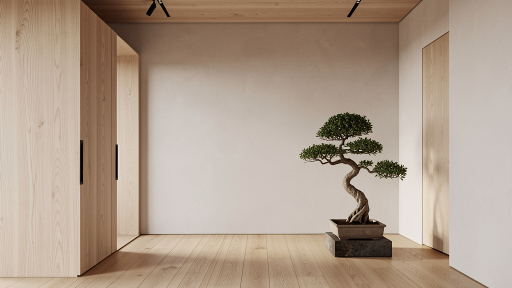
Q: Are there specific plants that fit Japandi aesthetics?
A: Yes—choose plants that embody wabi-sabi simplicity and natural form:
– Top Choices: Shimpaku juniper (bonsai-style), snake plant (sansevieria), ZZ plant, olive tree, dried botanicals.
– Why These Work: They have sculptural silhouettes, require minimal care, and age gracefully. Avoid overly showy flowers.
– Presentation Matters: Plant in simple, unglazed terracotta or matte black ceramic pots. Group three small plants together rather than one large arrangement. Why: Honors ma (space between) and wabi-sabi (celebrating individual form).
Q: Can Japandi work in a very sunny, bright climate (like Southern California or Australia)?
A: Brilliantly—and it solves common problems of glare and heat. Adaptations:
– Window Treatments: Use double-layer curtains: sheer linen closest to glass (diffuses light), blackout roller shade behind (for heat control). Why: Maintains hygge soft light while managing climate.
– Color Adjustments: Lean slightly cooler in neutrals—oat instead of warm beige, soft gray instead of greige. Why: Prevents space from feeling “hot” visually.
– Material Shifts: Choose lighter woods (ash over walnut), rattan or cane seating for breathability. Why: Natural materials stay cooler; textures enhance airflow perception.
Japandi’s emphasis on diffused light and natural materials is inherently suited to bright climates when thoughtfully adapted.
Q: How do I explain Japandi to my partner/family who prefer more traditional or maximalist styles?
A: Frame it as enhancement, not replacement. Focus on shared values:
– For Comfort-Lovers: “This style prioritizes cozy textures and warm lighting—like your favorite sweater for your home.”
– For Sentimental Keepers: “We’ll keep your cherished heirlooms. Japandi is about displaying fewer meaningful items so they’re truly seen.”
– Start Small: Redesign one shared space (like the bedroom) together. Let them choose the one accent object. Experience the calm together.
– Compromise Zone: Design common areas with Japandi principles, allow personal rooms to reflect individual styles. Lagom applies to relationships too—find “just enough” common ground.
Q: Is there a “wrong” way to do Japandi?
A: The most common pitfall is losing sight of the why. Watch for:
– Sterile Minimalism: Empty rooms with no soul. Gentle Fix: Add one meaningful object with history.
– Cultural Caricature: Using “Japanese” or “Scandinavian” items as props without understanding. Gentle Fix: Research the meaning; choose pieces that resonate personally.
– Rigid Rules: Forcing every item to fit a checklist. Gentle Fix: Ask “Does this bring calm or joy?” If yes, it belongs.
Japandi is a compass, not a cage. Your space should feel like you—calmer, more intentional, but authentically yours.
Q: How often should I change or update my Japandi space?
A: Embrace wabi-sabi’s appreciation of aging. True Japandi spaces evolve slowly:
– Seasonal Shifts: Change the single object in your tokonoma alcove—cherry blossoms in spring, a smooth stone in winter. Rotate textiles (lighter linen in summer, wool in winter).
– Patina Appreciation: Let wood darken, linen soften, ceramics develop character. These changes are the design.
– Intentional Updates: Only replace items that no longer serve function or joy. That repaired kintsugi bowl? Keep it. Its history is valuable.
Resist trend-driven changes. Your space should feel increasingly yours over time—not like a magazine spread that expires.
Q: Where do I start if I feel overwhelmed?
A: Begin with the 24-Hour Rule (detailed below). But specifically:
1. Clear One Surface: Choose a single shelf, windowsill, or coffee table. Remove everything.
2. Reintroduce with Intention: Place back only what serves function or sparks consistent joy. Leave generous space (ma) around each item.
3. Add One Soul Element: A smooth stone, a single stem in a small vase, a meaningful photo in a simple frame.
This micro-win builds confidence. You’ve just created a Japandi moment. Expand from there.
Conclusion and Your Next Step
Japandi interior design is not a destination to reach but a practice to cultivate—a gentle, daily return to intentionality in a world of noise. It invites us to slow down, to see beauty in the worn edge of a wooden spoon, to find comfort in the quiet glow of a paper lantern, and to design spaces that honor both our need for calm and our humanity. This isn’t about achieving perfection; it’s about creating environments where we can breathe deeper, connect more meaningfully, and feel truly at home. By choosing durable materials and embracing repair over replacement, these principles also align with mindful consumption and reduced environmental impact—a quiet contribution to a larger ecosystem of care.
Recap: The Three Anchors of Authentic Japandi
- Philosophy Over Aesthetics: Anchor decisions in wabi-sabi (beauty in imperfection) and hygge (cozy contentment). Gently ask: “Does this choice support calm and connection?”
- Intentional Curation: Embrace ma (meaningful space) and lagom (just enough). Remove before you add. Let emptiness breathe.
- Material Honesty: Choose natural, durable materials that age with grace. Honor the story behind objects—whether handmade, vintage, or thoughtfully restored.
The 24-Hour Rule: Your Tiny, Transformative Action
Within the next 24 hours, complete this single, specific action:
Clear the surface of your bedside table. Remove everything. Wipe it clean. Place back only three items:
1. A small glass of water
2. One object that brings quiet joy (a smooth stone, a single dried flower, a meaningful photo in a simple frame)
3. A warm-toned, low-wattage lamp (replace cool bulbs if needed)
Do not add anything else. Leave generous space around these items. Tonight, as you turn off the lamp, notice how this small act of ma and lagom shifts your transition into rest. This micro-practice contains the entire Japandi philosophy. Start here. Let it ripple outward.
The Big Picture: Design as a Practice of Living
Japandi ultimately transcends interior design. It’s a lens for living—a reminder that beauty resides in authenticity, that enough is abundant, and that our surroundings shape our inner world. As you apply these principles room by room, you’re not just arranging a house. You’re cultivating a sanctuary that supports your well-being, honors your story, and creates space for what truly matters. The worn spot on your wool rug? That’s where laughter happened. The slight warp in your ceramic mug? That’s the mark of a human hand. These aren’t flaws—they’re the quiet poetry of a life well-lived. Begin where you are. Use what you have. Honor the journey. Your most harmonious space is already within reach.
Explore Our Complete System:
The Mindful Home Audit: 7 Days to Intentional Living | Wabi-Sabi in Practice: Finding Beauty in Everyday Imperfection | Hygge at Home: Creating Cozy Rituals for Modern Life | Sustainable Sourcing Guide: Ethical Choices for Conscious Decor | The Japandi Color Workbook: Curating Your Personal Neutral Palette | Small Space Serenity: Japandi Principles for Apartments and Tiny Homes | Craftsmanship Connection: Supporting Artisans in Your Community